The Fryers
Services
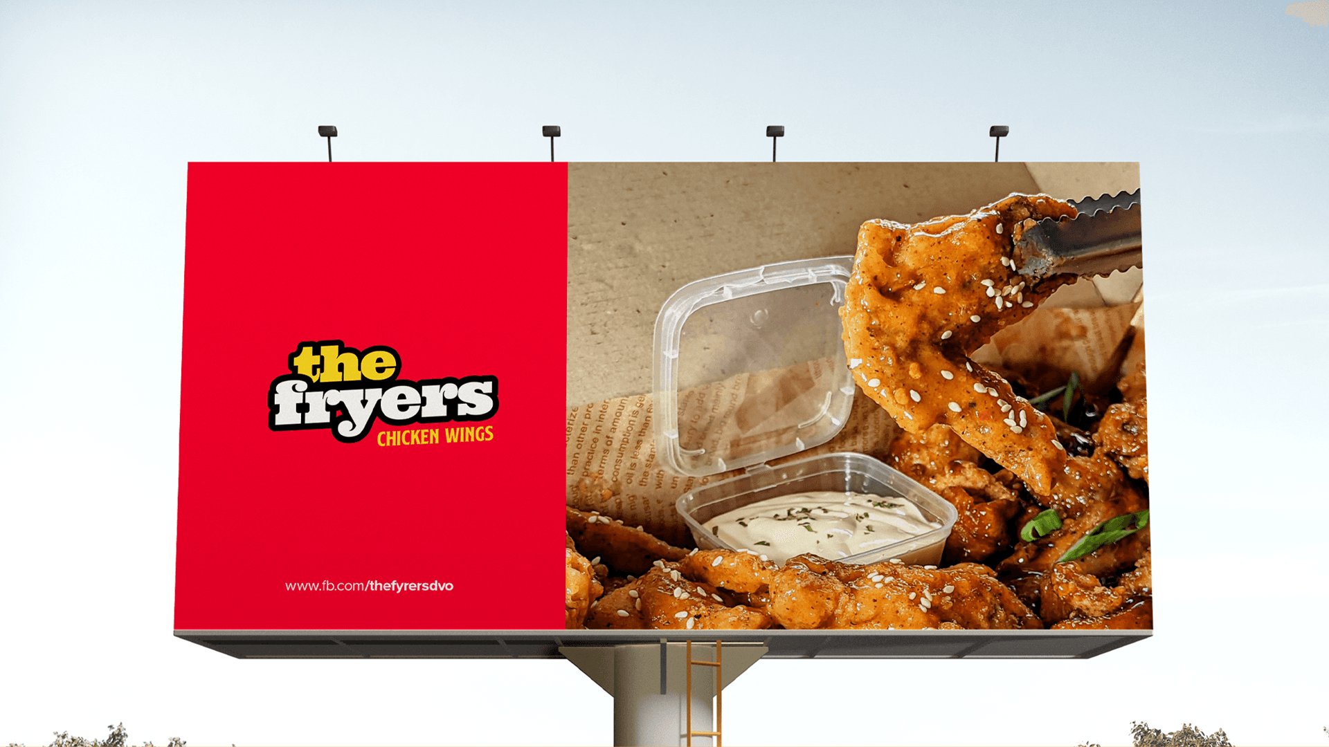
Graphic Design
Social Media Graphics
Visual Identity
Logo Design
Client
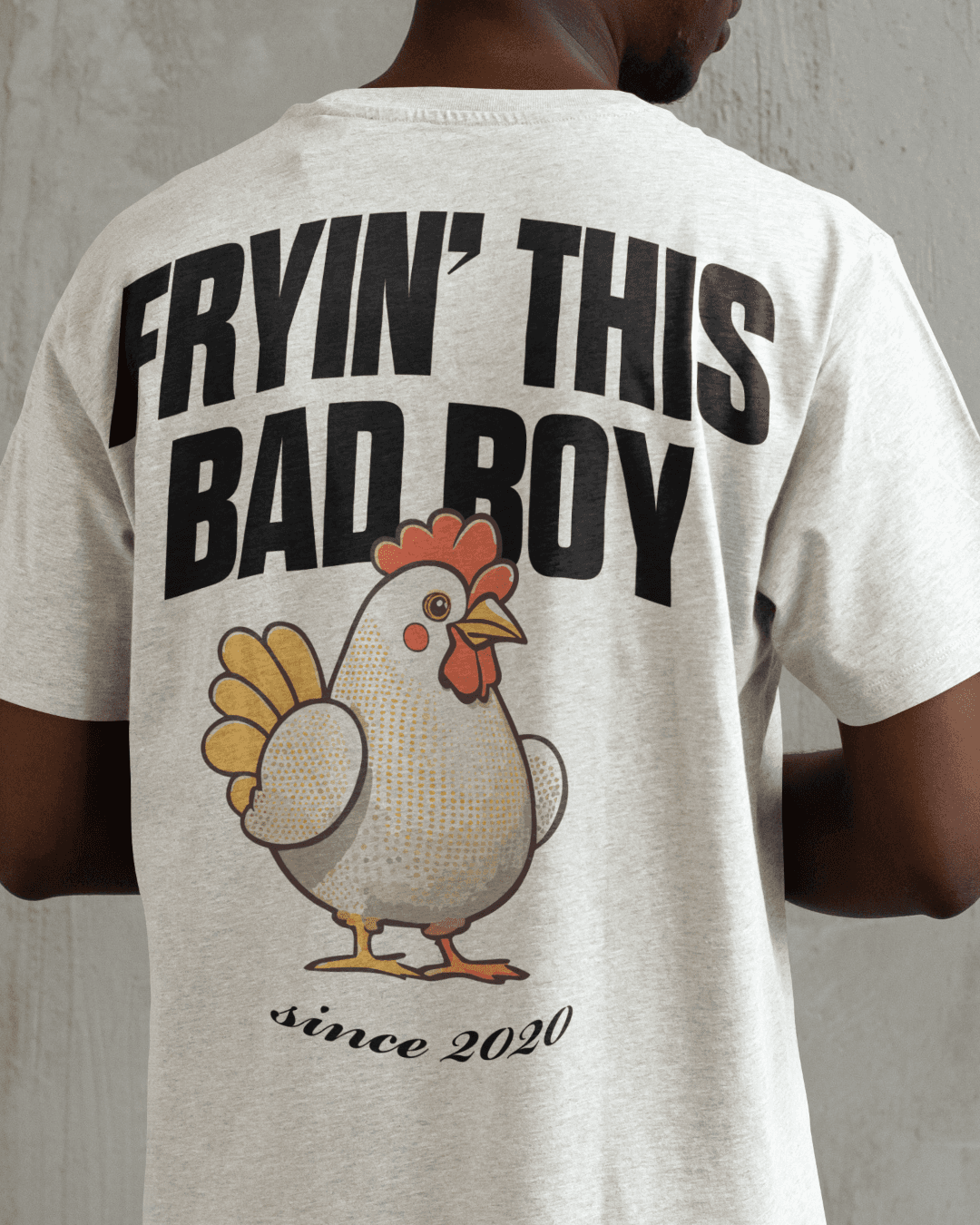
Ace & Max Belcar
Location
PH, Davao City
Year
2020
PROJECT OVERVIEW
The Problem
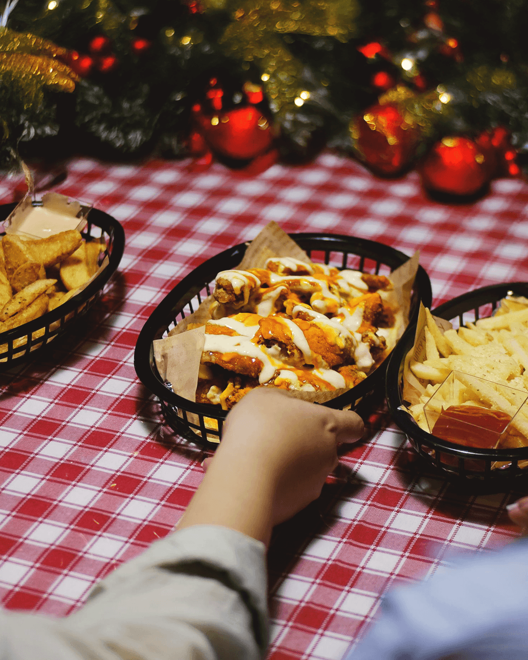
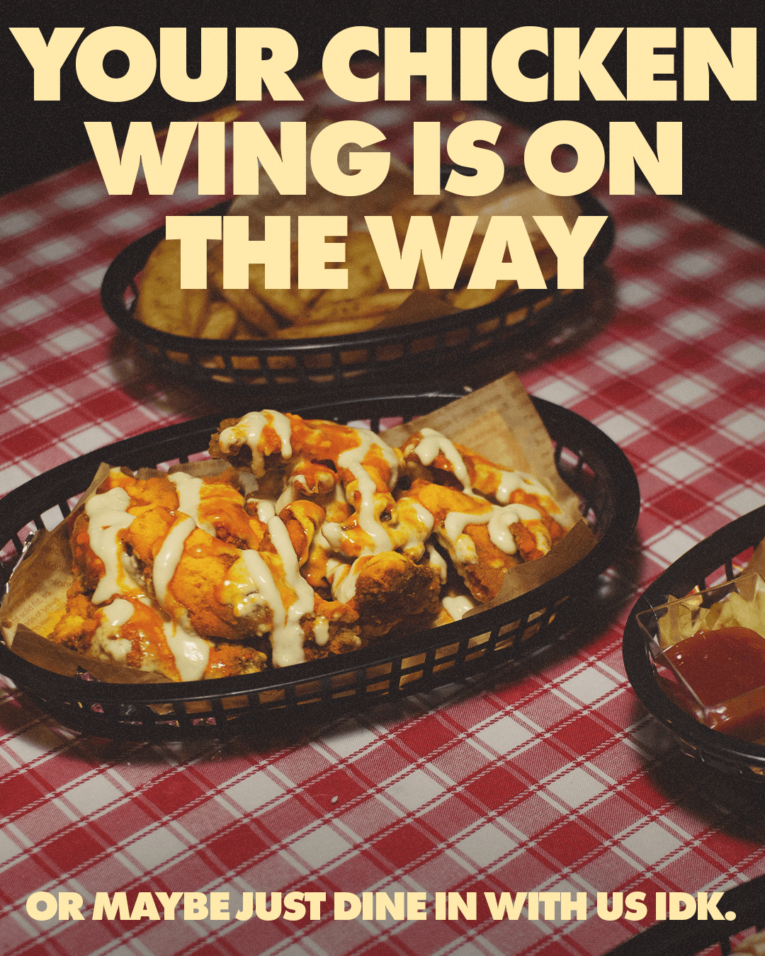
The Fryers launched during the COVID-19 pandemic, quickly gaining traction for their flavorful, high-quality chicken wings. As they expanded into dine-in and online delivery, they faced a challenge: how to look premium without coming across as overly polished or out of touch. They wanted a visual identity that felt fun, bold, and crave-worthy — but still elevated enough to reflect the quality of their food.
The Solution
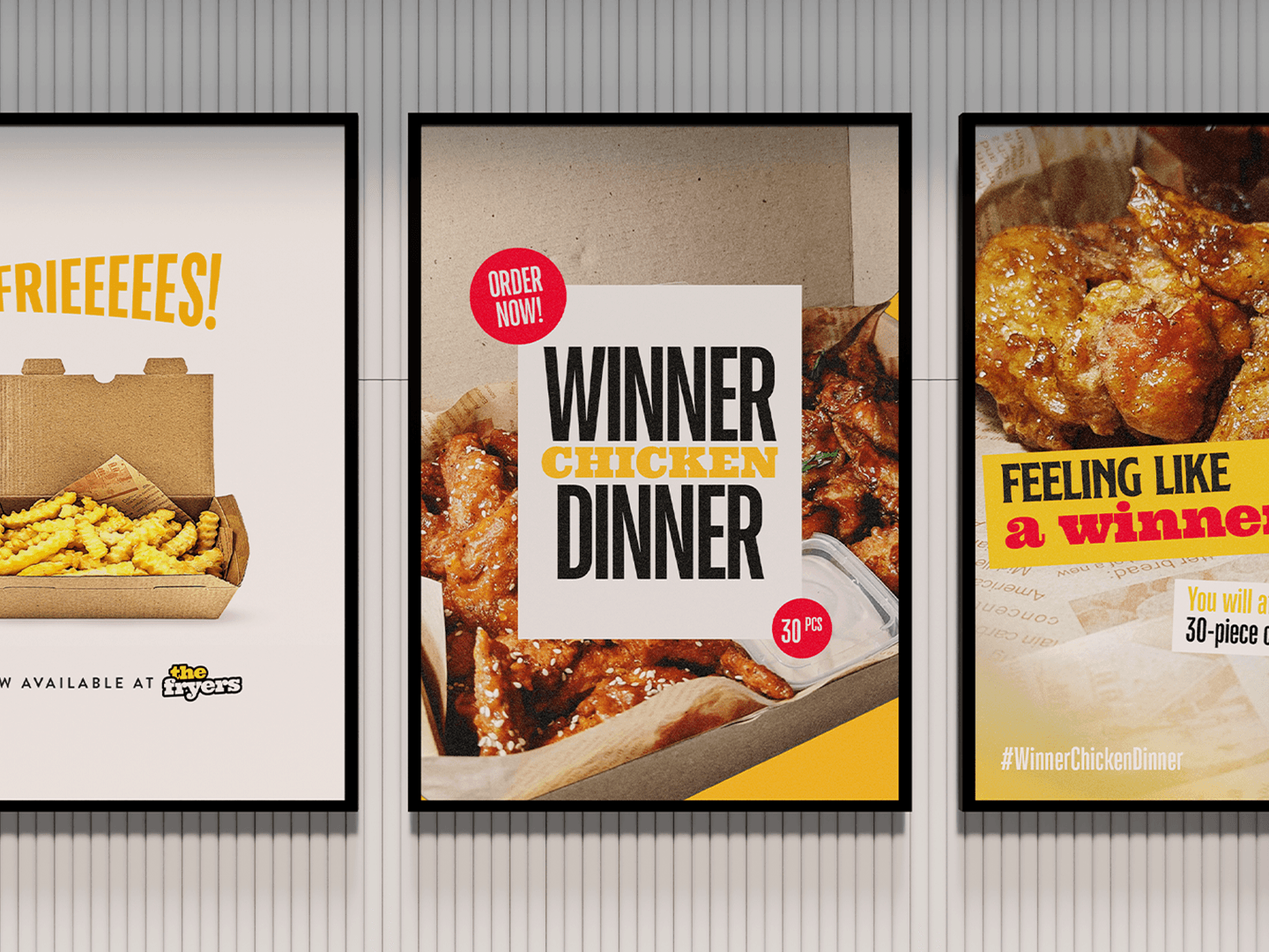
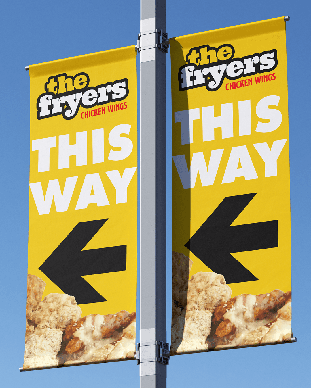
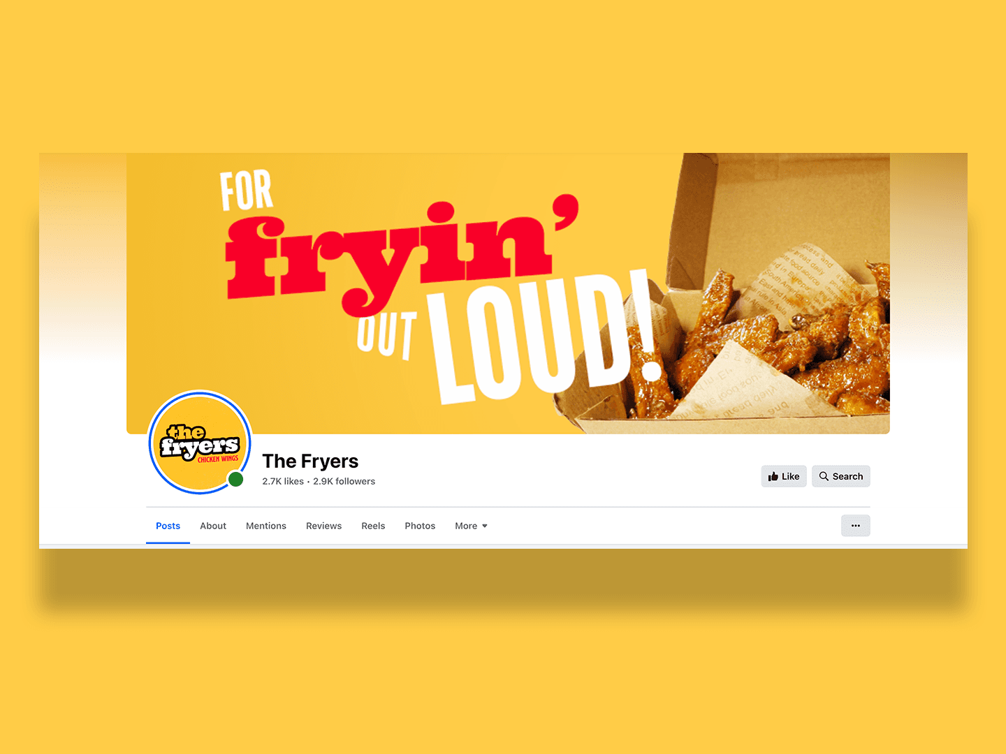
To bridge the gap between playful and premium, I began with a strategic mood board, pulling inspiration from food brands that hit that sweet spot. I focused on high-contrast color palettes and appetite-triggering hues like deep reds, golden yellows, and charcoal black to make their imagery pop.
I crafted a custom logotype and benchmarked it against other local brands to ensure The Fryers would stand out without straying too far from its roots. Every element — from typography to layout — was designed to be bold, recognizable, and adaptable across digital and print.
The Result
The Fryers received strong feedback on their new look — customers noted that it felt premium without looking expensive or pretentious. The brand’s visual identity instantly made an impact: bold colors and consistent presentation boosted social media recognition, all without a hefty design budget. The Fryers now serve up wings with a brand that looks as good as they taste.
Info
The Fryers is a Davao City-based food brand that found its roots during the height of the COVID-19 pandemic. What began as a small online venture selling flavorful chicken wings quickly grew into a local favorite. Today, The Fryers proudly serves their signature wings through both dine-in experiences and online delivery platforms — continuing to bring bold, satisfying flavors to customers wherever they are.